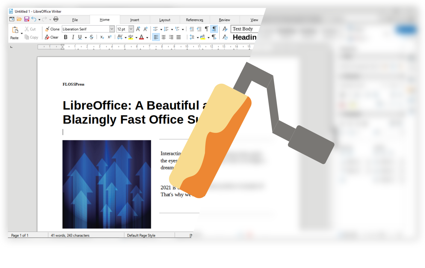
Here is a pretty promising UX plan going forward.
- There are multiple tabs for working on documents at once. The good news is that these tabs can be dragged and separated like tabs in a browser
- Start Center can still be accessed at the top right. In fact, you don't have to close all documents like before to access the Start Center
- The traditional menus (File, Edit, View etc.) can still be accessed via the dropdown in the Menu tab. This menu tab itself is like the main menu in MS Office which provides the main commands such as print, document properties and the like.
- You can keep using the standard/classic/traditional interface by accessing the shirt image icon on the top right.
- There is a global search tool that has the function of providing quick access to various available commands such as HUD or Tell Me, this global search tool can be used to find recent files and help content as well.
- Tabbed UI Notebookbar can be collapsed so that only the tabs remain with the ^ icon on the top right.
Of course all of this would only be possible if more and more talented and timely people joined in to contribute, and this post doesn't really represent the LibreOffice design team at all. We always lack people who want to help
Join now !!!.


