It was all started with the 16px blue folder that had a striking color at the time. I was really uncomfortable seeing an icon which had unmatched color choice with the larger one. It was looked so so out of place.
That is part of the elementary icon theme in LibreOffice that placed in LIBREOFFICE-INST-DIR/share/config/images_elementary.zip.
As soon as I unpacked the compressed file, my response at that time was "Wow, it looks like this icon theme needs more touch"
Maybe some of you know that in the latest fresh release (6.1), I managed to send my work to upstream: Karasa Jaga icon theme. That was my first real "visible" contribution so far. Unfortunately, Karasa Jaga has not been being default in any desktop environment nor operating system. So when I saw elementary, which is now the default theme of the GNOME desktop environment and its derivatives, I suddenly felt called back to plunge and immediately give more attention to this another colored icon theme.
elementary icon theme has indeed been "completed" last year, but I think there are many things that turn out to be many home works. Here some issues I've found:
1. Blurry Appearance, The Pixels Did Not Fit Right
Blurred icons are usually due to drawing process that did not follow the guide lines that are commonly available in drawing applications such as Inkscape. This causes the icon to look less clear and certainly not satisfying.
Let me show you some of the opaque icons I've found and also the work that has been done:
2. Childish Appearance
Looked so unprofessional, such as being drawn in a hurry situation, especially the smallest size of 16 px, they did not meet the official HIG from elementary own.
3. Different Appearance Between 16px*16px and 24px*24px Version
This is quite funny, but still annoying
3. Missing Many Fall Backed uno: Commands
So by default if a theme lack of an icon it will be eventually fall back to default - defined another icon theme.
4. Missing Many Non cmd Components
This two-month marathon job was really something that took up a lot of my free time. I have tried to give the best I could. Not to be forgotten, I also pay attention to synchronization with upstream changes of the elementary icon. But I am so grateful to be able to finish it with a relatively fast time span. Indeed, I admit this work sometimes made me forget the time. I could solemnly work on the icon theme even in more than 30 hours in the weekend. But yes there are many things I've learned from this process, especially compared to my previous activities against Karasa Jaga icon theme. I have learned new techniques in drawing, as well as git / gerrit management in LibreOffice.
The very latest part is localization for direct formatting function (B, I, U, etc). I'm afraid I can't do them in near future since now I would like to prepare for the born of my first child.
I can say this elementary almost reached maturity level just like Karasa Jaga. Except for localized interface part, it will not fallback to other icon theme because it is now very complete. You can always check all my works by installing latest master build:
 However, if you find something that is inappropriate or there is an icon that is still lacking, don't hesitate to make a report. You can make an issue to my github page or TDF Bugzilla.
For the TDF Bugzilla report, please add elementary META bug number (120949) to the Blocks field so I can track them easily.
Thanks for all LibreOffice Design members especially Andreas Kainz, Heiko Tietze, Adolfo Jayme Barrientos, etc and the whole community who always give me warm support and always open for new idea. I'm proud to be part of the community and hopefully my contribution could benefit more people all over the world.
Tabik.
 |
| You Are So Out of Place, Boy |
That is part of the elementary icon theme in LibreOffice that placed in LIBREOFFICE-INST-DIR/share/config/images_elementary.zip.
As soon as I unpacked the compressed file, my response at that time was "Wow, it looks like this icon theme needs more touch"
Maybe some of you know that in the latest fresh release (6.1), I managed to send my work to upstream: Karasa Jaga icon theme. That was my first real "visible" contribution so far. Unfortunately, Karasa Jaga has not been being default in any desktop environment nor operating system. So when I saw elementary, which is now the default theme of the GNOME desktop environment and its derivatives, I suddenly felt called back to plunge and immediately give more attention to this another colored icon theme.
elementary icon theme has indeed been "completed" last year, but I think there are many things that turn out to be many home works. Here some issues I've found:
1. Blurry Appearance, The Pixels Did Not Fit Right
Blurred icons are usually due to drawing process that did not follow the guide lines that are commonly available in drawing applications such as Inkscape. This causes the icon to look less clear and certainly not satisfying.
Let me show you some of the opaque icons I've found and also the work that has been done:
 |
| Blurred icons |
Looked so unprofessional, such as being drawn in a hurry situation, especially the smallest size of 16 px, they did not meet the official HIG from elementary own.
 |
| Childish, yeaa |
This is quite funny, but still annoying
 |
| Inconsistencies Here and There |
3. Missing Many Fall Backed uno: Commands
So by default if a theme lack of an icon it will be eventually fall back to default - defined another icon theme.
 |
| Fall Backed Menu Items |
4. Missing Many Non cmd Components
This
part argumentatively is a hard part since I have to check every menu or
dialog available which took icons from non cmd directory (cmd directory
is just contains .uno command so they are easier to be tracked). Here I
show
you direct comparisons:
5. Lack Of Support for Extra Large Size
I should say this frankly. My first focus was adding extra large (32px*32px) after seeing that blue out of place icons, and this one so satisfying me.

Last but not least, I could say this one is the most challenging part of designing LibreOffice icon: chart image. I had to manually learn the pattern and compared between them one by one. Another thing that the 3D part demanded me to dig into detail. Except for Net type chart, I used Galaxy icon theme as the main reference. So, we wouldn't lose excessive accuracy. You can see the comparison result from videos below (before then after):
 |
| Writer's Sidebar Navigator |
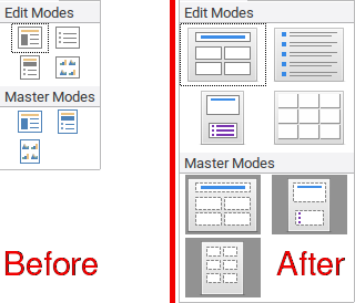 |
| Impress' Display Mode |
 |
| View Datasource and Exchange Database |
 |
| Impress' Sidebar Navigator |
 |
| Draw's Sidebar Shapes |
I should say this frankly. My first focus was adding extra large (32px*32px) after seeing that blue out of place icons, and this one so satisfying me.
Bonus
There are also a number of additional new icons that did not exist in the previous version, especially to support the Tabbed Notebookbar interface and some context menus. Here are some of the additions in meant:LibreOffice Writer
 |
| New Icons for Mail Merge Toolbar |
 |
| Track Changes With Accept All Changes and Reject All Changes |
LibreOffice Calc
 |
| New Calc Paste Special Icons |
 |
| New Calc's Rows Context Menu |
 |
| New Calc's Columns Context Menu |
 | |
| New Calc's Sheet Context Menu |
 |
| New Calc's Data Tab Icons (1) |
 |
| New Calc's Data Tab Icons (2) |
 |
| New Calc's Tools Tab Icons |
Last but not least, I could say this one is the most challenging part of designing LibreOffice icon: chart image. I had to manually learn the pattern and compared between them one by one. Another thing that the 3D part demanded me to dig into detail. Except for Net type chart, I used Galaxy icon theme as the main reference. So, we wouldn't lose excessive accuracy. You can see the comparison result from videos below (before then after):
This two-month marathon job was really something that took up a lot of my free time. I have tried to give the best I could. Not to be forgotten, I also pay attention to synchronization with upstream changes of the elementary icon. But I am so grateful to be able to finish it with a relatively fast time span. Indeed, I admit this work sometimes made me forget the time. I could solemnly work on the icon theme even in more than 30 hours in the weekend. But yes there are many things I've learned from this process, especially compared to my previous activities against Karasa Jaga icon theme. I have learned new techniques in drawing, as well as git / gerrit management in LibreOffice.
What Else?
I can say this elementary almost reached maturity level just like Karasa Jaga. Except for localized interface part, it will not fallback to other icon theme because it is now very complete. You can always check all my works by installing latest master build:
For the TDF Bugzilla report, please add elementary META bug number (120949) to the Blocks field so I can track them easily.
Thanks for all LibreOffice Design members especially Andreas Kainz, Heiko Tietze, Adolfo Jayme Barrientos, etc and the whole community who always give me warm support and always open for new idea. I'm proud to be part of the community and hopefully my contribution could benefit more people all over the world.
Tabik.


