Januari 20, 2023
Maret 23, 2022
LibreOffice Dark Mode on Windows Together with Dark Colibre Icon Theme
One of the trending UX features right now is dark mode. According to one study, 58% of Americans experience digital eye strain from using computers. One of the factors causing it is blue light radiation from the screen. That's where the possible idea of a screen that slows down your tired eyes more comes from.
Windows, as one of the biggest consumer desktop platforms, does not escape the dark mode feature. Since Windows 10, dark mode can be enjoyed by its users. Unfortunately, LibreOffice which is on the GNU/Linux platform has remarkable stand at following this trend thanks to its ability to blend in with system themes which has been a bitter pill to swallow over the past few years.
Let's say huge thanks to Caolán McNamara, one of the LibreOffice developers from Redhat who is usually on the UX/UI side of improving LibreOffice integration with GTK, for sending a patch so that LibreOffice for Windows can now enjoy dark mode.
Actually, this article wants to discuss the presence of the dark variant of the Colibre icon theme, but somehow after I sent the dark variant of the Colibre theme patch to the core, Caolán actually fulfilled the expectations of many years later.
Basically, apart from following the interface of the system in which it is installed, LibreOffice supports custom themes via Firefox personas, but unfortunately not all parts of the interface are changed with this Firefox persona. Only the standard toolbar can be themed, while the sidebar let alone the tabbed UI are completely untouched.
Half-hearted theme:
It getting worse with Tabbed UI:
Initially I wanted to make this Colibre variant dark icon theme as a trigger so that the dark mode in Windows is immediately materialized. It turned out that not long after that my wish was granted. To enable it, first thing first you must enable dark mode in OS level, then in LibreOffice, enable experimental features in Tools >
Options > LibreOffice > Advanced. Check "Enable experimental
feature (may be unstable)". LibreOffice will ask for restart and then automatically switch the UI to dark mode along with Colibre dark icon after restart.
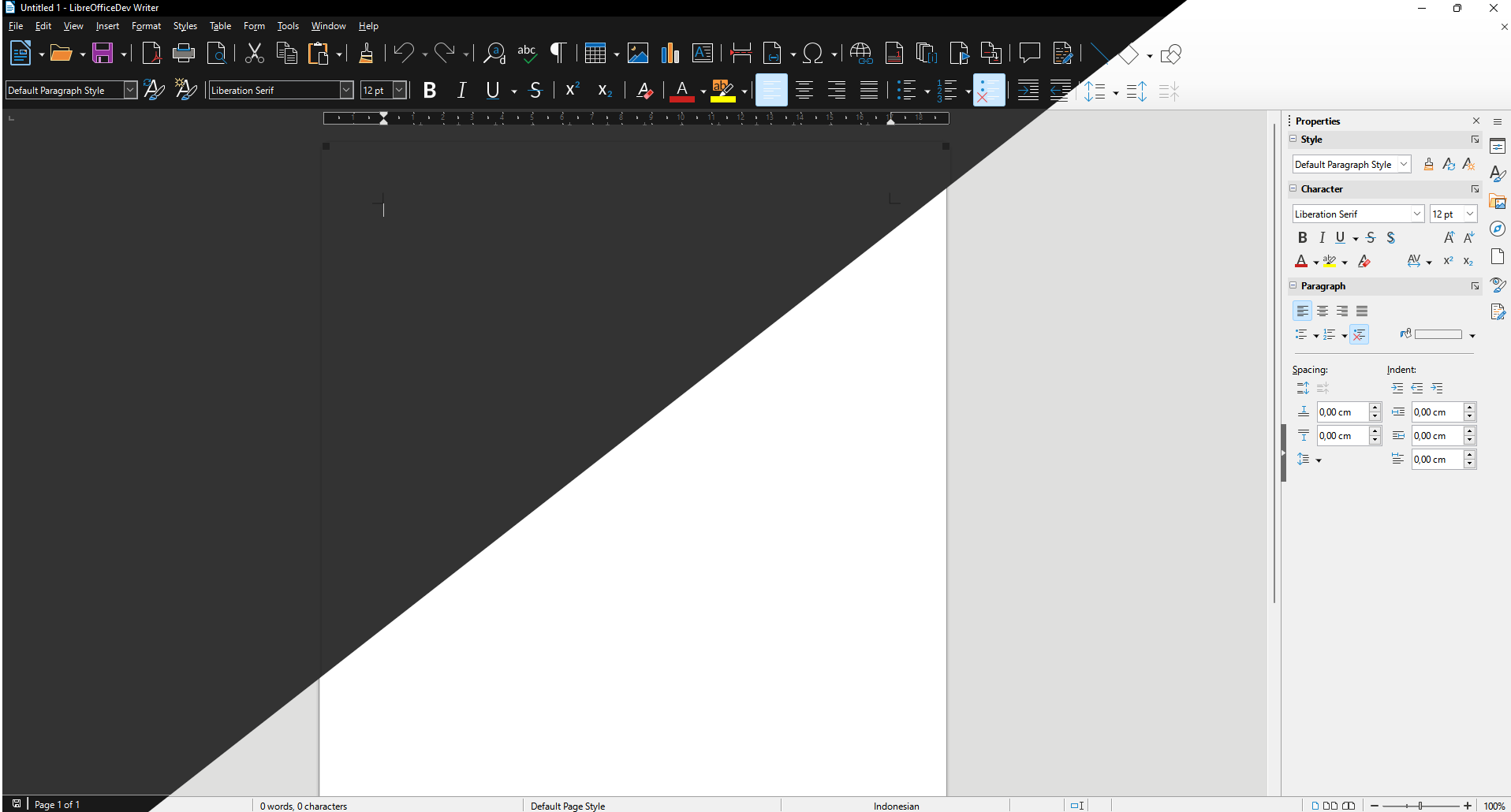
Here is what dark mode looks like on my Windows 11.
The Start Center looks very promising, the title bar got dark also.
Here you see the paper and the application area in the middle are still light in color, this is because this area is not included in the area controlled by theming based on the operating system. To make it dark, you have to go to Tools > Options > LibreOffice > Application Colors and select LibreOffice Dark in the scheme dropdown (Thanks Heiko Tietze for adding this dark color). With this it looks more all out. But in my opinion the colors of the paper and the background behind it should be different so they can be distinguished easier.
However, as dark mode feature is in early stage it turns out there will still be many shortcomings in several places. That's why the feature now is still in experimental mode. For example at first glance you can see the active button is bright blue which makes the icon invisible. This is not happen in Windows 10 by the way. In addition, the spin button is still brightly colored (look in the sidebar for example the indentation section).
Here more screenshots to look at
Calc
Impress
Draw
Here I like the Draw's paper edge line than Writer as it does not carry any blurred shadow. Never put blurred shadow in dark UI, period.
Base
Let's move on to popular Microsoft Office like UI: Tabbed UI (bonus: side by side Office 365)
Writer
Calc
Notice that MS Excel 365 is not activated dark content mode here:
Impress
Large icons:
Writer
Calc
Impress
Draw
Math
Base
At this state, I hope the feature disparity between operating systems is being reduced more and more. Now the only remaining big platform that LibreOffice hasn't gotten a dark mode feature is macOS. If LibreOffice in all three major operating systems (GNU/Linux, Windows and macOS) have already implemented perfect dark mode, LibreOffice community or developer should consider the existence of a toggle switch that can determine whether the light and dark theme follows the operating system or is self-determined. This kind of option is becoming more and more commonplace on various platforms.
You can enjoy this feature probably in version 7.4, or if you are impatient, please download the daily master build here.


